 Ryan Donnelly
Project: Jump$tart Clearinghouse
Jump$tart is a nation coalition dedicated to educating our nation’s youth to be more financially literate. One of the spotlights of their site is their Clearinghouse; a database of available resources (think books, teaching material, etc.) for youths. I had the opportunity to lead the effort at NewFoundry to provide a new Clearinghouse experience.
When I took over the project, requirements were already gathered and a trajectory was set. I was charged with the experience design (wireframing) and the engineering. The visual design would be handled by one of our designers.
Experience
For the experience of the Clearinghouse, my goal was not to reinvent the wheel, but rather borrow concepts and patterns from existing and proven web sites. I’m just going to show a couple of quick wireframing screens to illustrate the process a bit.
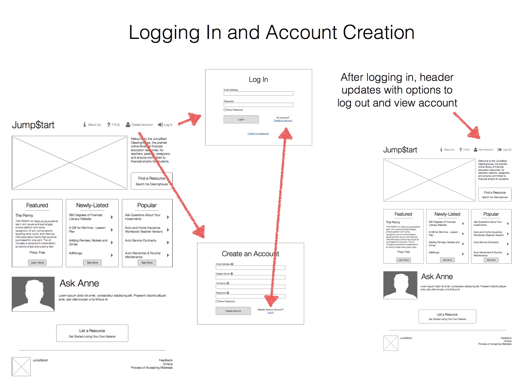
The account creation and log in flow is a good example of something that can often be overcomplicated. I’ll run through a couple decisions:
- We mirror Amazon in a lot of ways. They provide an easy way to bounce back and forth between log in and account creation, a show plain-text password function, and keep it pretty plain.
- We limited the required fields as much as possible to encourage sign-ups. We opted for “Full Name” and “Short Name” for a few reasons: 1) we could support any name and weren’t limited to those with easy first and last names (think international, etc.), 2) we didn’t really care what the short name was (first name, some username, whatever), we just needed a way to identify the user for comments and other activity.

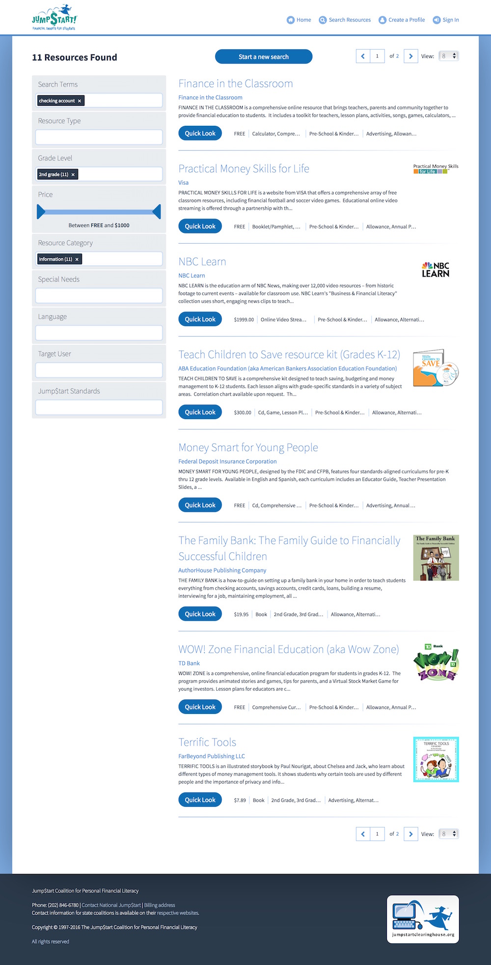
Search was a main component of the redesign. We spent a lot of time researching the results page looking at patterns from Amazon, Google, and especially Zappos. Zappos had an easy interface that we liked because we knew we would be doing a lot of filtering after the initial search. A few of the decisions we came to were:
- We wanted to encourage discovery and browsing so we added a “Quick Look” button to resources. This would open a modal with more information about the resource allowing the user to view multiple resources 1) without leaving the page, and 2) without cluttering the results.
- It was important to be able to modify and augment the search on the results page as this is not a search engine that will provide the “right” answer every time. Most users will be looking for a resource and that satisfies certain criteria, not one individual resource or even the “top” resource.
- We kept a lot of the text space small so as to not clutter the page, and instead opted to show things in the “Quick Look” modal or in a tooltip bubble.
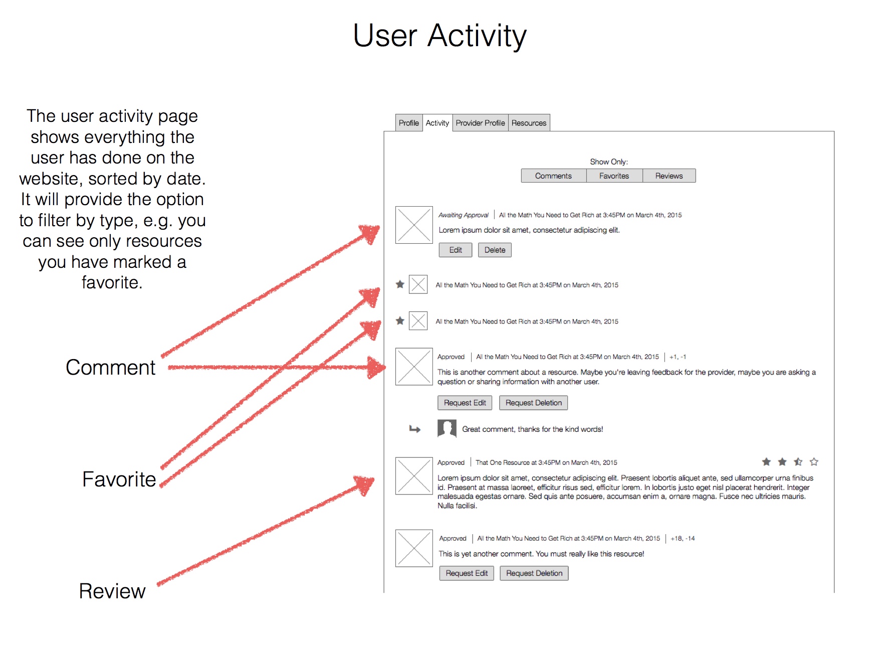
The activity page is pretty straight-forward, it’s a profile page that will show the user’s activity (comments, reviews, favorites). The wireframe does a good job of illustrating all the different states (approved, upvotes/downvotes) and components (filtering, replies) we were trying to incorporate.
The Status
The Jump$tart Clearinghouse is currently live and serving almost 1000 resources to promote financial literacy. It was a cool project and I’m glad we could help! You can find it at http://clearinghouse.jumpstart.org.
Thanks for reading!